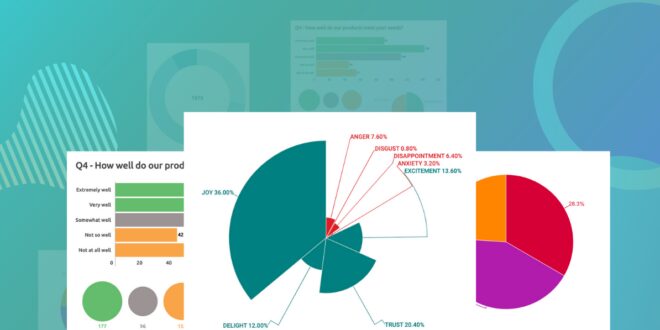
Charts help us make sense of complex information by simplifying them into bite-sized and colorful graphic visual representations.
You can use visual representations of information to boost your brand and create captivating content for social media and websites. But how do you create charts that make an impact?
This guide gives you some great tips for creating charts that help, not hinder, the message you’re trying to send. Read on!
Table of Contents
1. Choose the Right Chart Type for Your Data
Different types of data need different types of charts to display them most effectively. Pie and bar charts are best suited for visualizing percentages, as they are simple to read. Line charts are best for visualizing trends and changes over time.
They can show the precise intervals of time between data points. When thinking about the type of chart to use for a specific dataset, it’s best to use the chart type that will most showcase the data.
2. Make Use of Labels, Axes, Legends, and Scales
Using labels allows one to convey an extra dimension of information. Labels can help to illustrate the meaning of both points and their position across the y-axis and x-axis. Axes help to provide more context and meaning to chart elements by providing a scale against which to measure and compare the output.
Legends should be used to provide a key indicating which elements correspond to which parts of the chart. It is a visual tool to display a title and explain the various points.
3. Use Color to Reinforce Data Points
Utilizing contrasting colors, such as light and dark shades of color, will draw the eye to the data points in the chart, helping to reinforce a visual understanding of the trends and relationships.
It is a good idea to limit the number of colors used in the chart’s legend to no more than 4-5, as too many colors can be distracting and create confusion. Different shades of the same color can also be used to help facilitate a viewers understanding of the data.
4. Streamline Design to Focus Attention on the Data

This means using clean and simple chart design elements. These can be line charts, bar charts, and pie charts. This is to avoid overwhelming the viewer and drawing attention away from the data points.
Be sure to use legible font size, and keep the axes labels clear and informative. Consider chart layout and size: place chart elements in a logical order and condense the size of the chart to improve its impact.
5. Capture Maximum Impact in Visual Presentations
Start by making sure your data is accurate and organized in a way that is easy to understand and accessible. Use relevant technology for visualization, such as heat maps, graphics, and dynamic graphics, to communicate your messages.
By leveraging creative tools, such as converting your image from PNG to SVG, presentations are more likely to capture maximum impact by compellingly conveying important data.
Keep things simple by avoiding overwhelming your viewers with cluttered diagrams and unnecessary information. Focus on the main points and the story behind your data.
Creating Charts in an Impressive Way
Creating charts will command attention and spark conversation. Be sure to use the best practices discussed in this article to ensure your charts have maximum impact. Review your color choices, labeling, size, and context to make sure everything is consistent and legible.
So, why wait? Get started today!
Make sure to check out some of our other technical articles for more helpful guides and tips.